
MOBILE APP
UX/UI DESIGN
BOXING
TRAINING
Project Overview
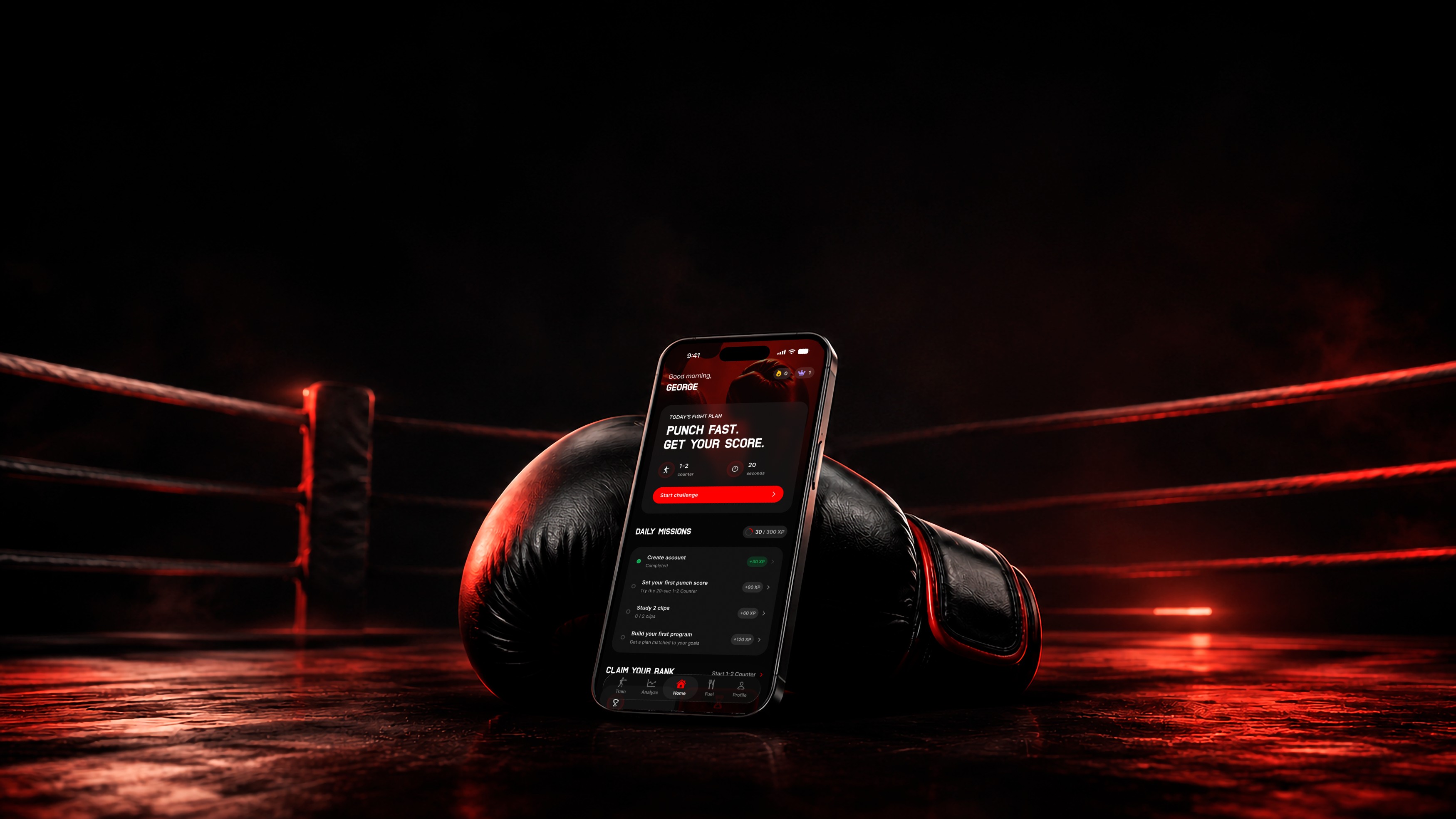
Brawlr is an iOS boxing app with AI training, programs, tracking, nutrition, footage analysis, and rankings. The homepage had strong features, but lacked clear hierarchy and direction.
by riviele poliana
THE CHALLENGE
The goal was to redesign the homepage for new and returning users, improving feature discovery and daily engagement while keeping missions, XP, streaks, and rank.

Outcome
The new experience gives users one clear next action, connects progression systems, and makes key features easier to discover without overwhelming the screen.
UX AUDIT
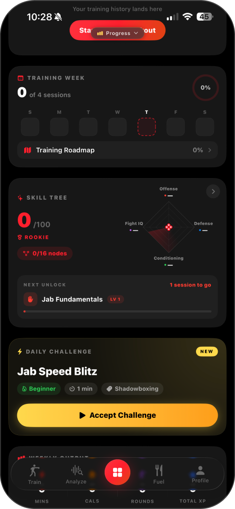
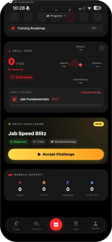
key issues
HOMEPAGE HIERARCHY
No Clear First Action
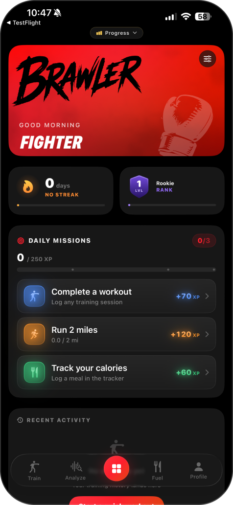
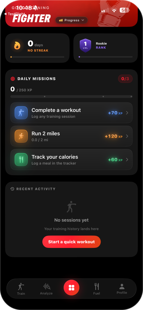
The homepage presents multiple systems at once, including streaks, rank, XP, missions, and recent activity. Without a clear primary action, new users must decide what matters most instead of being naturally guided toward the product's core experience.
FEATURE DISCOVERY
High-Value Features Are Hidden
Brawlr's strongest engagement features are buried behind navigation and receive the same visual priority as secondary tools. As a result, many users may never experience the features designed to drive activation and long term retention.
PROGRESSION SYSTEM
Motivation Feels Fragmented
Streaks, XP, Rank, and Daily Missions operate as separate systems rather than one connected progression loop. Because the relationship between them is unclear, users struggle to understand how today's actions contribute to long term progress.
NEW USER EXPERIENCE
The Homepage Doesn't Guide First Time Users
The interface assumes users already understand the product. Instead of introducing the core experience step by step, new users are immediately exposed to multiple features, making the first session feel exploratory rather than intentionally guided.
research

Research Foundation
The redesign was informed by established principles from Laws of UX, mobile interaction patterns, and gamification frameworks. These references helped validate decisions around hierarchy, cognitive load, progressive disclosure, motivation, and the timing of rewards throughout the homepage experience.

Principles Applied
The experience was structured to reduce decision fatigue, make the next action immediately clear, and create visible momentum from the first session. Principles such as the goal-gradient effect, selective attention, chunking, and progressive disclosure guided how missions, progress, ranking, and feature discovery were organized.

ux strategy
Engagement Loop
Engagement Loop
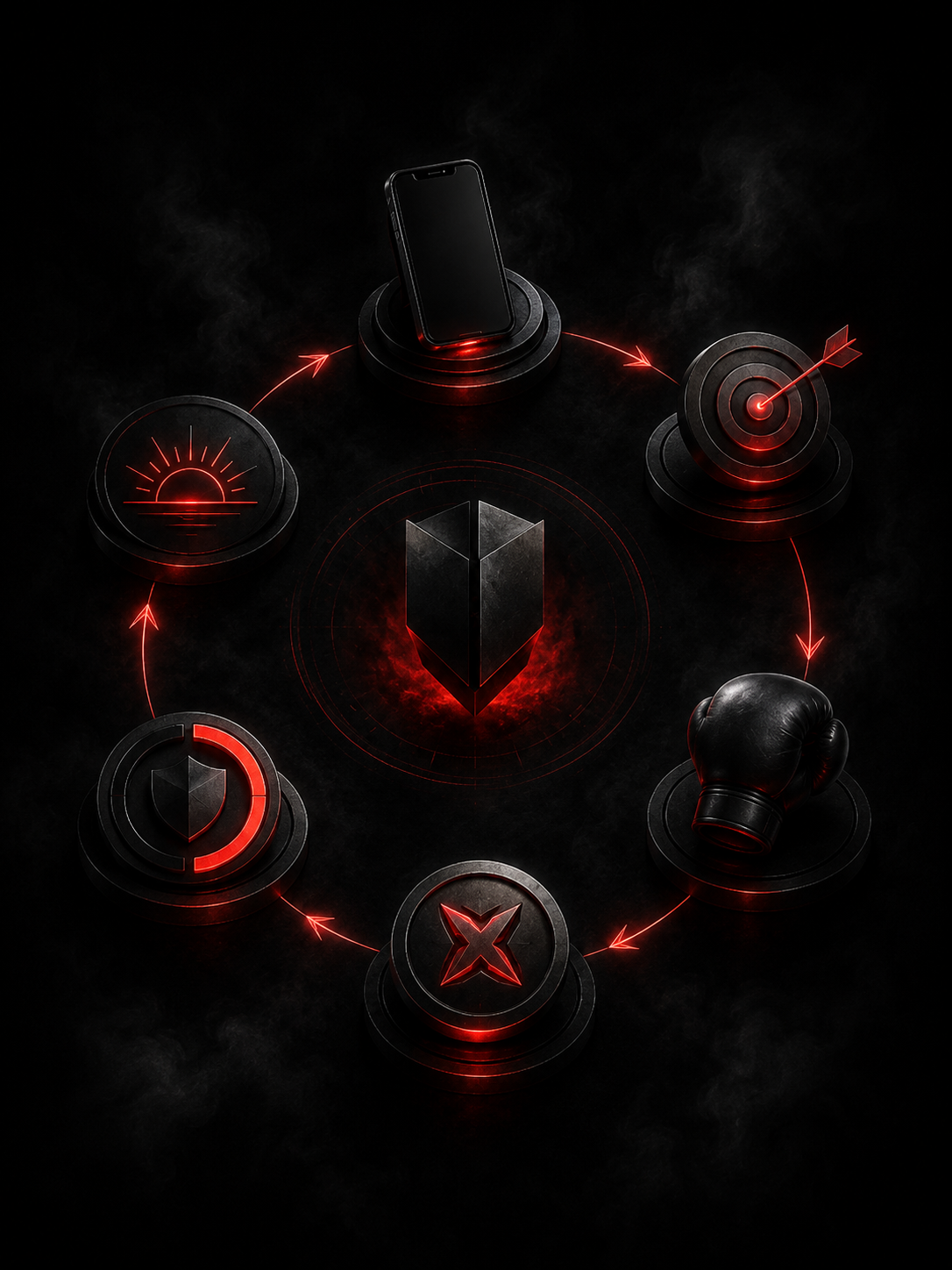
The homepage was redesigned around one clear behavioral loop: open the app, understand today’s goal, complete an action, earn XP, unlock progress, and return the next day. Each section now supports this sequence instead of competing for attention.
State Logic
New users need activation, guidance, and a quick first win. Returning users need continuity, relevant progress, and a clear next step. The homepage adapts its hierarchy and content to support each stage of the journey.

Key Design Decisions
#1
Prioritize the First Punch Score
The 1–2 Counter became the primary action for new users because it delivers Brawlr’s value in only 20 seconds through an immediate score and ranking opportunity.

#2
Create Immediate Progress
New users begin with the account creation mission already completed. This prevents the experience from starting at zero and creates early momentum.
#3
Connect the Daily Missions
The missions now form a guided journey from setting a first score to learning techniques and building a personalized training program.
#4
Adapt to the User’s State
New users receive activation and guidance, while returning users see their training week, active program, daily challenge, and relevant progress.

#5
Make Rank the Reward
Leaderboard access is positioned as the outcome of completing the 1–2 Counter, connecting the challenge to a clear competitive payoff.
#6
Reduce Secondary Competition
Streak, level, profile insights, and feature exploration remain accessible but use less visual weight than the most relevant daily action.

#7
Connect the Progression System
Missions, XP, streaks, and rank now work as one behavioral loop, showing how each completed action contributes to long-term progress.
Final Experience
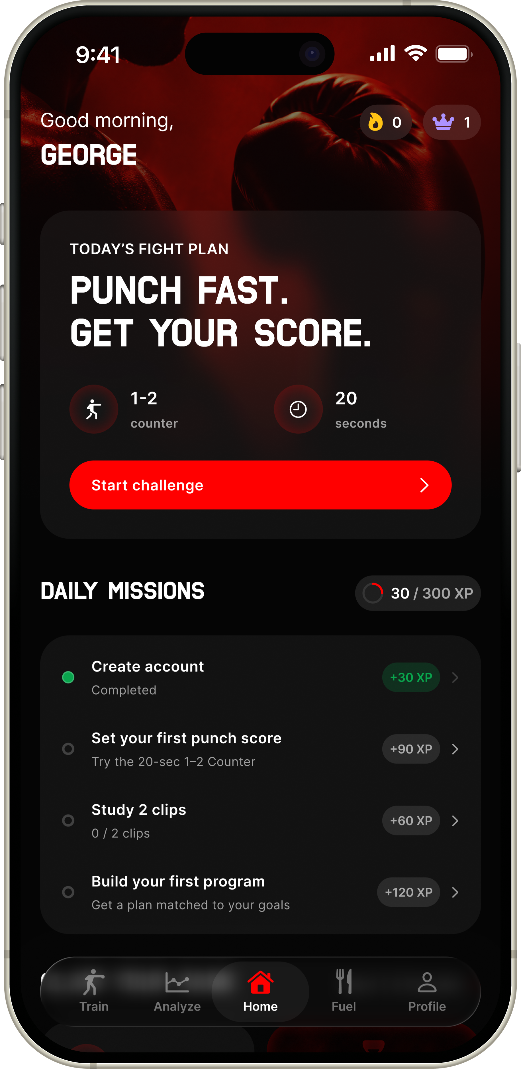
The final homepage adapts to the user’s stage. New users receive a guided path to their first meaningful result, while returning users are brought directly back into their training routine.
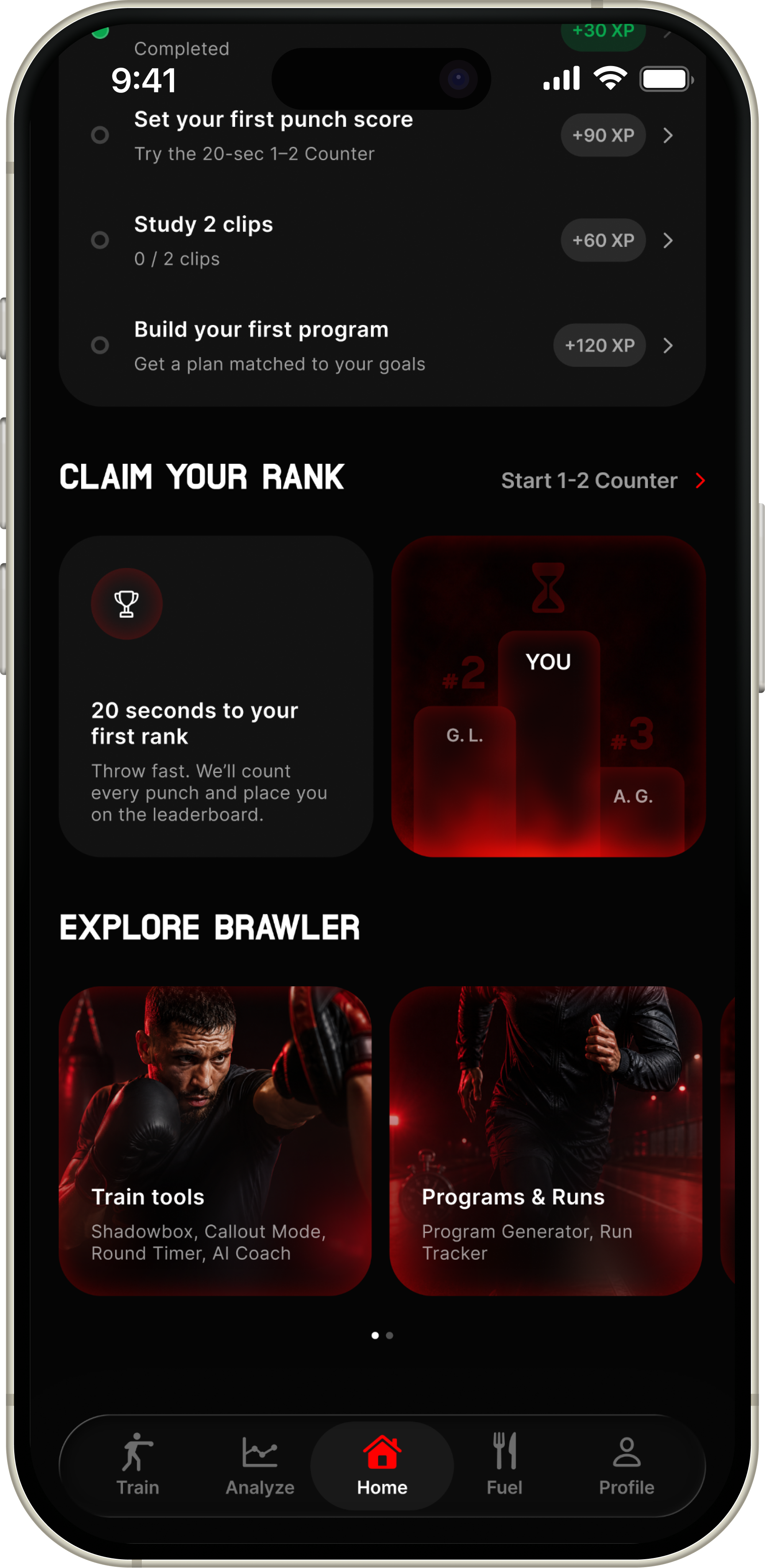
New User
The experience prioritizes a quick first win. The 1–2 Counter becomes the main action, supported by guided missions, immediate XP progress, and a clear path toward unlocking a first rank.
Clear first action
Start with the 20-second 1–2 Counter.
Immediate progress
Account creation already earns the first XP.
Guided missions
Each task introduces the next valuable feature.
Rank activation
The first score unlocks the competitive loop.
Returning User
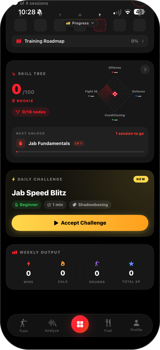
The homepage shifts from onboarding to continuity. Training Week, the next program session, and the Daily Challenge are prioritized, while performance feedback reinforces visible improvement.
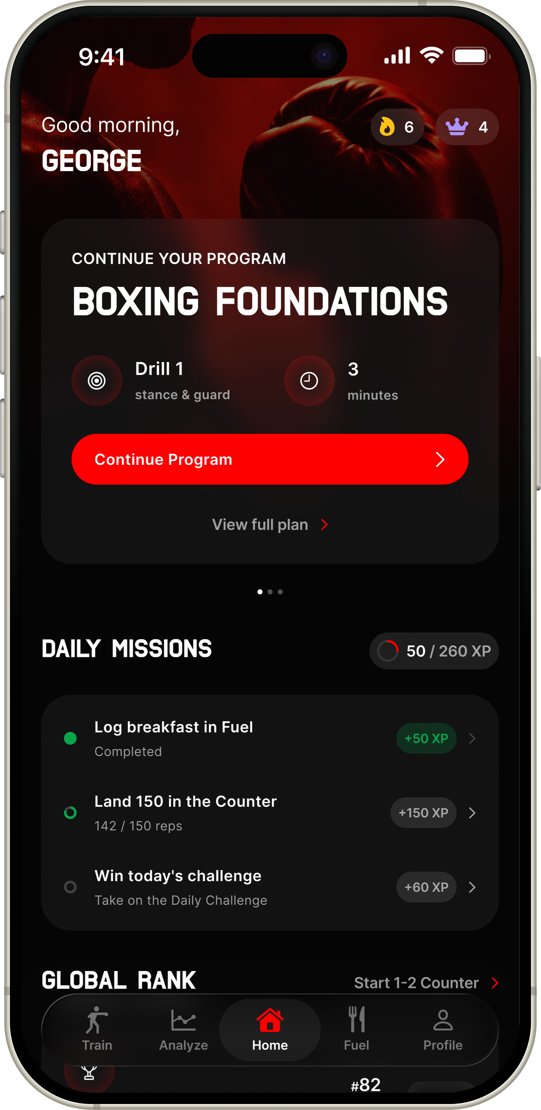
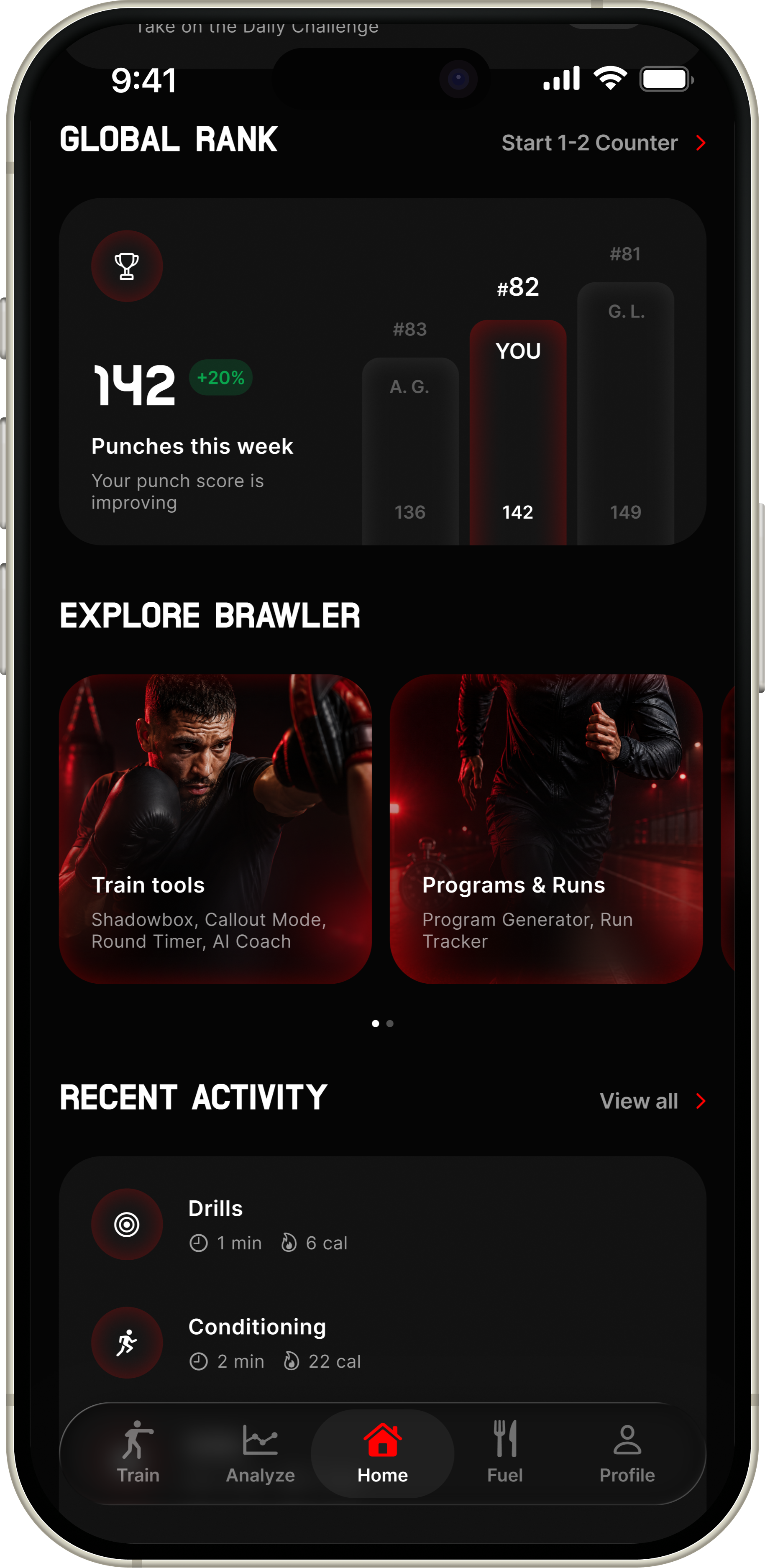
Resume instantly
Continue the next scheduled session.
Weekly direction
See training progress at a glance.
Daily motivation
Complete a fresh challenge for extra XP.
Visible improvement
Track performance and competitive progress.
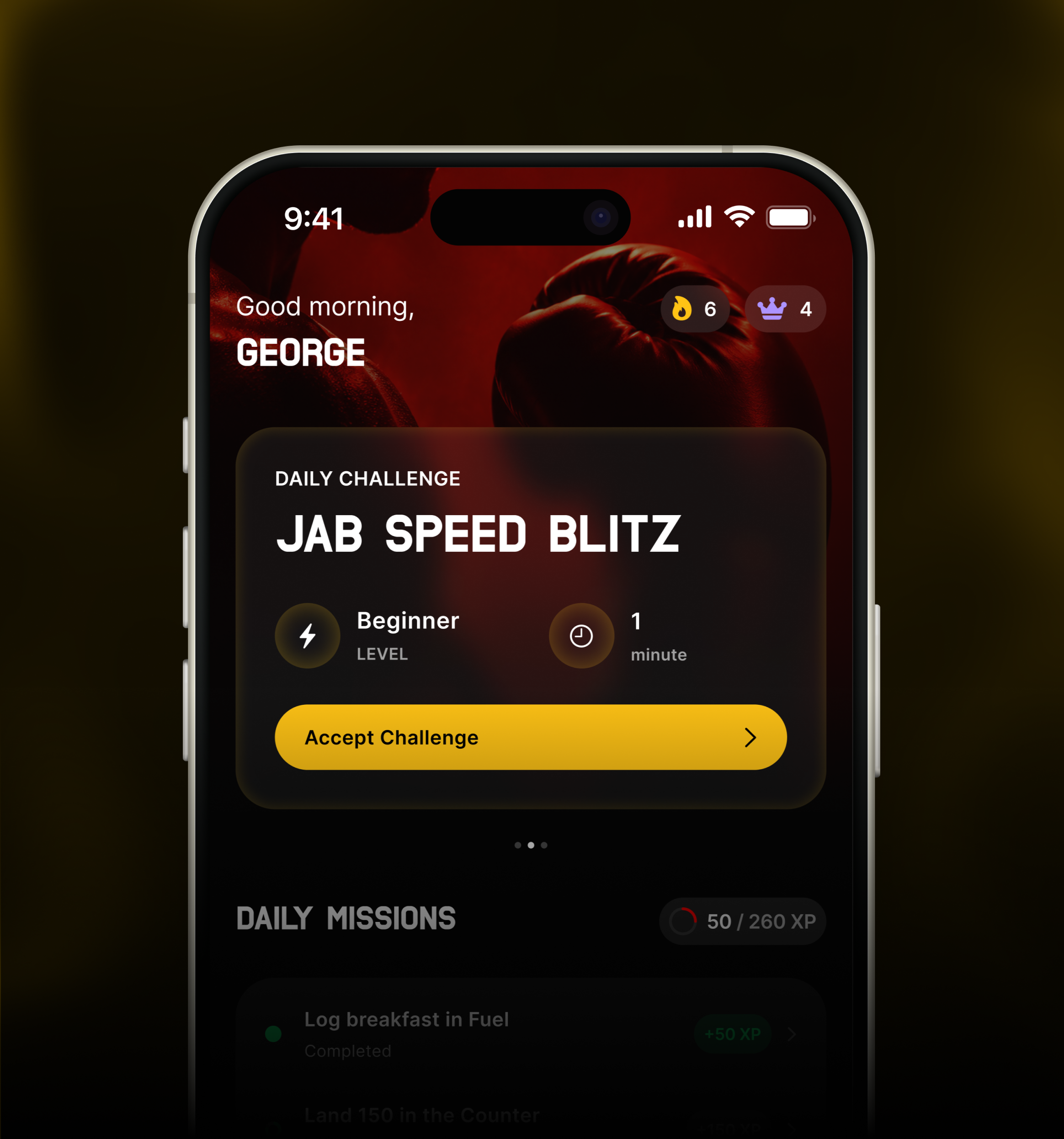
daily challenge
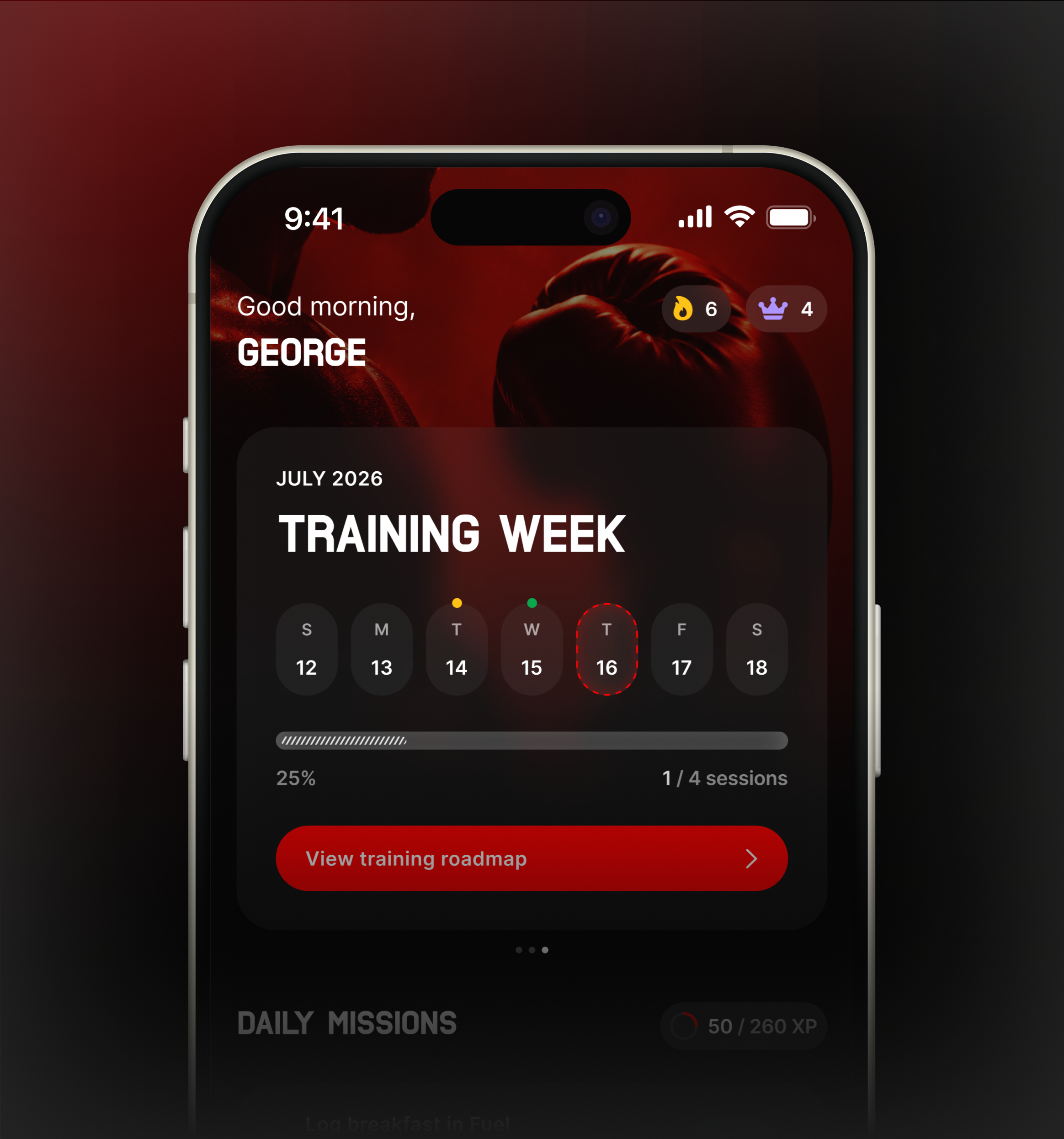
The Daily Challenge appears in the top slider after the primary action, giving returning users a fresh and time-sensitive reason to keep training. It adds variety, encourages repeat visits, and supports daily engagement without competing with the user’s main session.
training week
Training Week gives returning users a quick view of their current routine, completed sessions, and upcoming work. Placing it near the top keeps continuity visible and helps users understand what to do next without navigating through the app.
final thoughts
outcome
The redesigned homepage provides one clear next action, connects Brawlr’s progression mechanics, and adapts the experience to each user stage.


Next steps
Engagement Loop
The homepage was redesigned around one clear behavioral loop: open the app, understand today’s goal, complete an action, earn XP, unlock progress, and return the next day. Each section now supports this sequence instead of competing for attention.
next steps
#1
Usability Testing
Validate the new homepage with beginner and returning boxers to identify friction, confusion, and missed actions.
#2
Measure Activation
Track first 1–2 Counter completion, mission completion, and program generation to confirm the new-user flow is working.
#3
Evaluate Retention
Monitor daily return rate, streak continuation, Daily Challenge participation, and seven-day retention.
#4
Refine Personalization
Improve how the primary action, missions, and homepage slider adapt to each user’s history and training stage.
#5
Prototype Interactions
Test transitions, progress feedback, bottom sheets, and reward moments to make the experience feel more responsive and motivating.
#6
Iterate From Data
Use behavioral analytics and user feedback to refine hierarchy, copy, rewards, and feature discovery over time.
thanks for watching :)
ALL RIGhtS RESERVED | BY RIVIELEPOLIANA.COM
MOBILE APP
UX/UI DESIGN

BOXING
HOMEPAGE
Project Overview
Brawlr is an iOS boxing app with AI training, programs, tracking, nutrition, footage analysis, and rankings. The homepage had strong features, but lacked clear hierarchy and direction.
by riviele poliana
THE CHALLENGE
The goal was to redesign the homepage for new and returning users, improving feature discovery and daily engagement while keeping missions, XP, streaks, and rank.
Outcome
The new experience gives users one clear next action, connects progression systems, and makes key features easier to discover without overwhelming the screen.
UX AUDIT
key issues
HOMEPAGE HIERARCHY
No Clear First Action
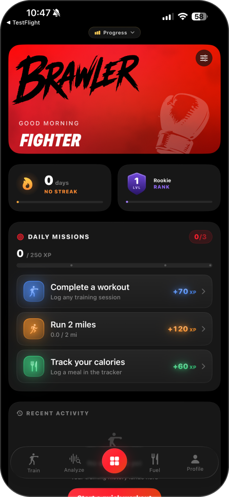
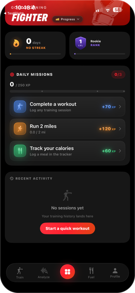
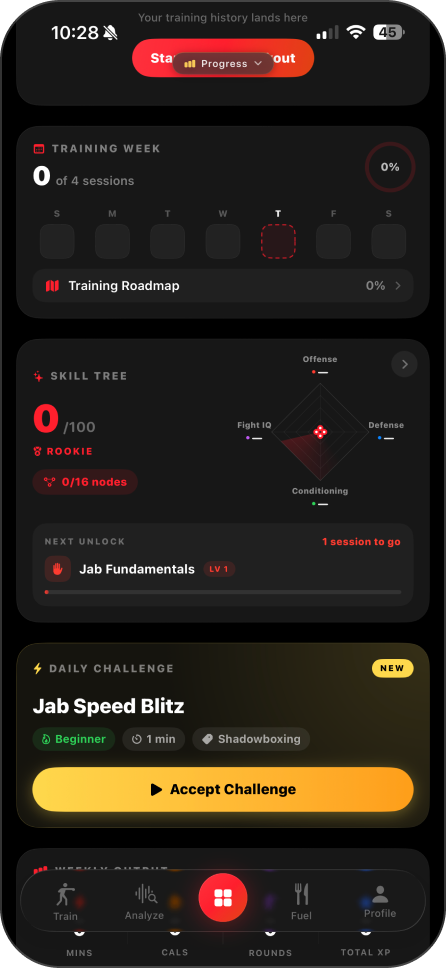
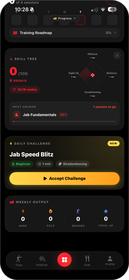
The homepage presents multiple systems at once, including streaks, rank, XP, missions, and recent activity. Without a clear primary action, new users must decide what matters most instead of being naturally guided toward the product's core experience.
FEATURE DISCOVERY
High-Value Features Are Hidden
Brawlr's strongest engagement features are buried behind navigation and receive the same visual priority as secondary tools. As a result, many users may never experience the features designed to drive activation and long term retention.
PROGRESSION SYSTEM
Motivation Feels Fragmented
Streaks, XP, Rank, and Daily Missions operate as separate systems rather than one connected progression loop. Because the relationship between them is unclear, users struggle to understand how today's actions contribute to long term progress.
NEW USER EXPERIENCE
The Homepage Doesn't Guide First Time Users
The interface assumes users already understand the product. Instead of introducing the core experience step by step, new users are immediately exposed to multiple features, making the first session feel exploratory rather than intentionally guided.
research

Research Foundation
The redesign was informed by established principles from Laws of UX, mobile interaction patterns, and gamification frameworks. These references helped validate decisions around hierarchy, cognitive load, progressive disclosure, motivation, and the timing of rewards throughout the homepage experience.
Principles Applied
The experience was structured to reduce decision fatigue, make the next action immediately clear, and create visible momentum from the first session. Principles such as the goal-gradient effect, selective attention, chunking, and progressive disclosure guided how missions, progress, ranking, and feature discovery were organized.
ux strategy
Engagement Loop
The homepage was redesigned around one clear behavioral loop: open the app, understand today’s goal, complete an action, earn XP, unlock progress, and return the next day. Each section now supports this sequence instead of competing for attention.
State Logic
New users need activation, guidance, and a quick first win. Returning users need continuity, relevant progress, and a clear next step. The homepage adapts its hierarchy and content to support each stage of the journey.

Key Design Decisions
#1
Prioritize the First Punch Score
The 1–2 Counter became the primary action for new users because it delivers Brawlr’s value in only 20 seconds through an immediate score and ranking opportunity.
#2
Create Immediate Progress
New users begin with the account creation mission already completed. This prevents the experience from starting at zero and creates early momentum.
#3
Connect the Daily Missions
The missions now form a guided journey from setting a first score to learning techniques and building a personalized training program.
#4
Adapt to the User’s State
New users receive activation and guidance, while returning users see their training week, active program, daily challenge, and relevant progress.
#5
Make Rank the Reward
Leaderboard access is positioned as the outcome of completing the 1–2 Counter, connecting the challenge to a clear competitive payoff.
#6
Reduce Secondary Competition
Streak, level, profile insights, and feature exploration remain accessible but use less visual weight than the most relevant daily action.
#7
Connect the Progression System
Missions, XP, streaks, and rank now work as one behavioral loop, showing how each completed action contributes to long-term progress.
Final Experience
The final homepage adapts to the user’s stage. New users receive a guided path to their first meaningful result, while returning users are brought directly back into their training routine.
New User
The experience prioritizes a quick first win. The 1–2 Counter becomes the main action, supported by guided missions, immediate XP progress, and a clear path toward unlocking a first rank.
Clear first action
Start with the 20-second 1–2 Counter.
Immediate progress
Account creation already earns the first XP.
Guided missions
Each task introduces the next valuable feature.
Rank activation
The first score unlocks the competitive loop.
Returning User
The homepage shifts from onboarding to continuity. Training Week, the next program session, and the Daily Challenge are prioritized, while performance feedback reinforces visible improvement.
Resume instantly
Continue the next scheduled session.
Weekly direction
See training progress at a glance.
Daily motivation
Complete a fresh challenge for extra XP.
Visible improvement
Track performance and competitive progress.
daily challenge
The Daily Challenge appears in the top slider after the primary action, giving returning users a fresh and time-sensitive reason to keep training. It adds variety, encourages repeat visits, and supports daily engagement without competing with the user’s main session.
training week
Training Week gives returning users a quick view of their current routine, completed sessions, and upcoming work. Placing it near the top keeps continuity visible and helps users understand what to do next without navigating through the app.
final thoughts
outcome
The redesigned homepage provides one clear next action, connects Brawlr’s progression mechanics, and adapts the experience to each user stage.
Next steps
The redesigned homepage provides one clear next action, connects Brawlr’s progression mechanics, and adapts the experience to each user stage.
next steps
#1
Usability Testing
Validate the new homepage with beginner and returning boxers to identify friction, confusion, and missed actions.
#2
Measure Activation
Track first 1–2 Counter completion, mission completion, and program generation to confirm the new-user flow is working.
#3
Evaluate Retention
Monitor daily return rate, streak continuation, Daily Challenge participation, and seven-day retention.
#4
Refine Personalization
Improve how the primary action, missions, and homepage slider adapt to each user’s history and training stage.
#5
Prototype Interactions
Test transitions, progress feedback, bottom sheets, and reward moments to make the experience feel more responsive and motivating.
#6
Iterate From Data
Use behavioral analytics and user feedback to refine hierarchy, copy, rewards, and feature discovery over time.
thanks for watching :)
ALL RIGhtS RESERVED | BY RIVIELEPOLIANA.COM
MOBILE APP
UX/UI DESIGN

BOXING
HOMEPAGE
Project Overview
Brawlr is an iOS boxing app with AI training, programs, tracking, nutrition, footage analysis, and rankings. The homepage had strong features, but lacked clear hierarchy and direction.
by riviele poliana
THE CHALLENGE
The goal was to redesign the homepage for new and returning users, improving feature discovery and daily engagement while keeping missions, XP, streaks, and rank.
Outcome
The new experience gives users one clear next action, connects progression systems, and makes key features easier to discover without overwhelming the screen.
UX AUDIT
key issues
HOMEPAGE HIERARCHY
No Clear First Action
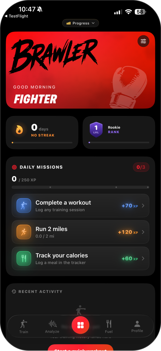
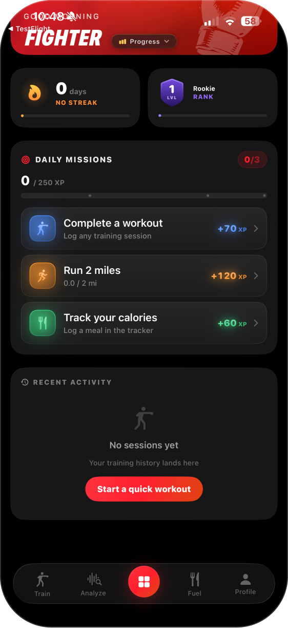
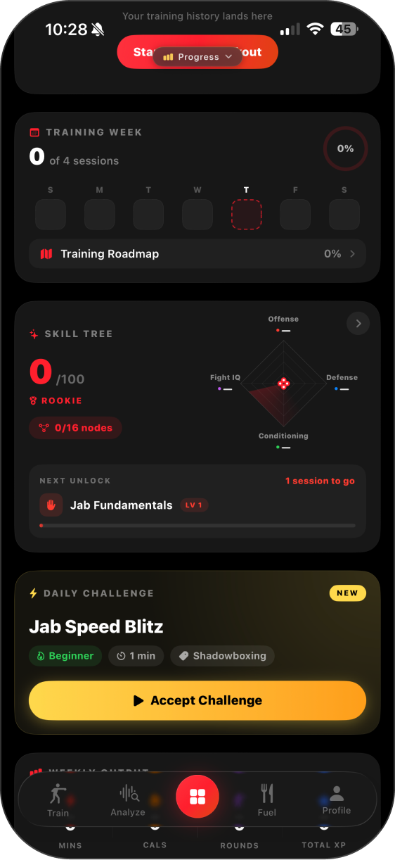
The homepage presents multiple systems at once, including streaks, rank, XP, missions, and recent activity. Without a clear primary action, new users must decide what matters most instead of being naturally guided toward the product's core experience.
FEATURE DISCOVERY
High-Value Features Are Hidden
Brawlr's strongest engagement features are buried behind navigation and receive the same visual priority as secondary tools. As a result, many users may never experience the features designed to drive activation and long term retention.
PROGRESSION SYSTEM
Motivation Feels Fragmented
Streaks, XP, Rank, and Daily Missions operate as separate systems rather than one connected progression loop. Because the relationship between them is unclear, users struggle to understand how today's actions contribute to long term progress.
NEW USER EXPERIENCE
The Homepage Doesn't Guide First Time Users
The interface assumes users already understand the product. Instead of introducing the core experience step by step, new users are immediately exposed to multiple features, making the first session feel exploratory rather than intentionally guided.
research

Research Foundation
The redesign was informed by established principles from Laws of UX, mobile interaction patterns, and gamification frameworks. These references helped validate decisions around hierarchy, cognitive load, progressive disclosure, motivation, and the timing of rewards throughout the homepage experience.
Principles Applied
The experience was structured to reduce decision fatigue, make the next action immediately clear, and create visible momentum from the first session. Principles such as the goal-gradient effect, selective attention, chunking, and progressive disclosure guided how missions, progress, ranking, and feature discovery were organized.
ux strategy
Engagement Loop
The homepage was redesigned around one clear behavioral loop: open the app, understand today’s goal, complete an action, earn XP, unlock progress, and return the next day. Each section now supports this sequence instead of competing for attention.
State Logic
New users need activation, guidance, and a quick first win. Returning users need continuity, relevant progress, and a clear next step. The homepage adapts its hierarchy and content to support each stage of the journey.

Key Design Decisions
#1
Prioritize the First Punch Score
The 1–2 Counter became the primary action for new users because it delivers Brawlr’s value in only 20 seconds through an immediate score and ranking opportunity.
#2
Create Immediate Progress
New users begin with the account creation mission already completed. This prevents the experience from starting at zero and creates early momentum.
#3
Connect the Daily Missions
The missions now form a guided journey from setting a first score to learning techniques and building a personalized training program.
#4
Adapt to the User’s State
New users receive activation and guidance, while returning users see their training week, active program, daily challenge, and relevant progress.
#5
Make Rank the Reward
Leaderboard access is positioned as the outcome of completing the 1–2 Counter, connecting the challenge to a clear competitive payoff.
#6
Reduce Secondary Competition
Streak, level, profile insights, and feature exploration remain accessible but use less visual weight than the most relevant daily action.
#7
Connect the Progression System
Missions, XP, streaks, and rank now work as one behavioral loop, showing how each completed action contributes to long-term progress.
Final Experience
The final homepage adapts to the user’s stage. New users receive a guided path to their first meaningful result, while returning users are brought directly back into their training routine.
New User
The experience prioritizes a quick first win. The 1–2 Counter becomes the main action, supported by guided missions, immediate XP progress, and a clear path toward unlocking a first rank.
Clear first action
Start with the 20-second 1–2 Counter.
Immediate progress
Account creation already earns the first XP.
Guided missions
Each task introduces the next valuable feature.
Rank activation
The first score unlocks the competitive loop.
Returning User
The homepage shifts from onboarding to continuity. Training Week, the next program session, and the Daily Challenge are prioritized, while performance feedback reinforces visible improvement.
Resume instantly
Continue the next scheduled session.
Weekly direction
See training progress at a glance.
Daily motivation
Complete a fresh challenge for extra XP.
Visible improvement
Track performance and competitive progress.
daily challenge
The Daily Challenge appears in the top slider after the primary action, giving returning users a fresh and time-sensitive reason to keep training. It adds variety, encourages repeat visits, and supports daily engagement without competing with the user’s main session.
training week
Training Week gives returning users a quick view of their current routine, completed sessions, and upcoming work. Placing it near the top keeps continuity visible and helps users understand what to do next without navigating through the app.
final thoughts
outcome
The redesigned homepage provides one clear next action, connects Brawlr’s progression mechanics, and adapts the experience to each user stage.
Next steps
The redesigned homepage provides one clear next action, connects Brawlr’s progression mechanics, and adapts the experience to each user stage.
next steps
#1
Usability Testing
Validate the new homepage with beginner and returning boxers to identify friction, confusion, and missed actions.
#2
Measure Activation
Track first 1–2 Counter completion, mission completion, and program generation to confirm the new-user flow is working.
#3
Evaluate Retention
Monitor daily return rate, streak continuation, Daily Challenge participation, and seven-day retention.
#4
Refine Personalization
Improve how the primary action, missions, and homepage slider adapt to each user’s history and training stage.
#5
Prototype Interactions
Test transitions, progress feedback, bottom sheets, and reward moments to make the experience feel more responsive and motivating.
#6
Iterate From Data
Use behavioral analytics and user feedback to refine hierarchy, copy, rewards, and feature discovery over time.
thanks for watching :)
ALL RIGhtS RESERVED | BY RIVIELEPOLIANA.COM